Friday, December 16, 2016

Semester Final

Name Typography


Rebranding


This semester in class, we have done a variety of different kinds of projects. We put our name into different kinds of typography, rebranded a company, and are currently working on any other projects from clients that we have met with for endorsement hours. In every project that has been assigned, myself and most everyone has has come into contact with at least one kind of obstacle to get around in some way. For me, some of the challenges I face were getting the type to look right on my name typography project, or not getting lines lined up while rebranding the logo of our company. While doing these projects we get together and tell each other how to possibly make better of someone’s project such as making a color a little brighter, or changing a font because it doesn’t fit with the design or idea of the project. In this class the overall deign process is very well organized and helps put together your project piece by piece and allows you to make minor adjustments that could make it look much better than you would expect.

            During class, you must spend your time in the best and most optimal way that you possibly can. For example, if you are stuck on what to do and catch yourself sitting and just staring at your screen, get up and ask someone around you some possible ideas of what you can do to improve your work and get your brain working on what to do next. Early on in the year I caught myself doing that exact thing, stuck, not knowing what to do next, just staring with a blank face at my screen. I have been better about doing so, and cannot recall doing it at all in the past few weeks. Anytime you think you’re finished with a project, you probably aren’t. There will almost always be something that you can improve, something that I learned. During our name typography project, I thought I was done early when I clearly could improve my project in many different ways that I did not realize. Even while outside of class, there are things to work on. Even though I don’t have a mac at home, I can still work on projects. I have done things such as almost all of my sketches at my house and using a computer to gain ideas and possible outcomes of a project. Or use my time to talk to a client about possible outcomes for his or her project that they have given to me to complete.

            As a graphic designer, I currently have more weaknesses than I could think of since I have not been doing it for too long, but they have been slowly going away as the year progresses and I learn how to do new things. Besides that, this year I have gained many strengths and have been using them to my advantage to get a project done, and make it look good and not something that was rushed in all of five minutes. To maximize my strengths, I use my time in class wisely to get my work turned in on time, and help classmates if they are stuck trying to do something to the best of my ability.

            Some areas that I need to focus on improving is learning how to use some of the tools that I may not know how to use as well as others, in any sort of program especially InDesign, which I am currently learning how to use it while we are re doing our restaurant menus. It has most of the same tools, but some new ones that I have yet to experiment with.


            This semester in graphic design has been a wonderful experience and has led me to learn much, much more than I expected. This class has been so amazing and I have met some new people along the way and have had a great time while doing so. Next semester, I will know what I need to do differently and improve my experience in this class. The big thing I have learned this year is that every minutes counts in this class and to use it as best as you can. In all, this semester has been amazing and am ready for next year to come!

Friday, September 16, 2016

Name typography

This year in e-Comm our first project was name typography. It dealt with many different fonts that were supposed to represent things we liked or things we liked to do. For example, if we liked going to the beach, then we would make a font that felt like you were at the beach. So make the o in your name a beach ball or add some "sand" around your name.

The process for doing this was very long but very interesting at the same time. First I made my sketches for all of my possibilities. At least three concepts for each category. After the sketches we went to the computer to put our ideas into illustrator and start looking for fonts that were similar to ur sketches. After we collected our fonts we put them into illustrator and cleaned up minor flaws that we had. Once all of our fonts were the way we liked them we put them into indesign with crop marks and bleed and then print them to go onto the last step. We then cut out all of our fonts and sprayed them onto a matboard and then after that we were finished once we put the description of the project on the back.

During this project I learned many new things about where illustrator has put all of their tools after updating it, as well as indesign. I also learned how to make precise cuts with an x-acto knife and how to cut your finger while doing so.

For the next project we have I wouldn't do many things differently besides maybe come to class after school to work a little if I need to and at the same time not to push myself if I am ahead on my work. Things I would do the same is ask for help when I need it but try to ask someone around me first. This why I try to solve my problems myself and manage my how how I wold like to and not stress over a project at the last minute.

From this project I have had many experiences such as how to cut and how not to cut matboard as well as regular paper and where not to put your phone when spraying at the table.

Overall this project was really unique in its own way just as all the others are. I have made many experiences from it and will take those and put them into each project going forward.

Thursday, May 19, 2016

Technical Tutorial Review

In this tutorial I will be showing you how to make ice cream and how to color and texturize it. But before you start make sure your workspace is set to modeling in the top left of your screen.


For your first step you will make 
a sphere by clicking the sphere tool on the 
far left under polygons.


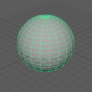
Then you should have a sphere in your workspace and it should look like this.


Next you will hold down the 

right click on your mouse 
and go down to assign 
favorite material and 
then let go once your mouse 
is hovering over lambert.
Then you will see a menu
appear on the right of 
your screen. Click the grey
box next to the word color.


Then the color menu will appear. 
Change the H value to 60
the S value to 0.207,
and the V value to 1.


Now your sphere should look 
something like this.


Then still being in the attribute editor, click the 
checkered box across from bump mapping.


After you click on bump mapping look for
the texture called fractal.


Then under the fractal attributes lower the 
amplitude down to 0.048.


Then you have your ice cream!!!

Professional Article Review


The link above leads to a professional article by Annie Gray, a journalist who talks about motion tracking in many famous movies including Avatar --- no not the animated one, the one about the blue people.

The article basically talks about how professional animators use motion tracking in movies to turn someones skin to blue from its original color. We need this skill so that way we can still have different skin colors like green and blue as well as others. Also its not just for skin color, it's also for showing emotion such as Deadpool's mask. The author does show very good points but has trouble defending them. Also her conclusion over the whole thing is that animators need motion tracking to pull off incredible projects to make such amazing movies.

In her article she had many good points, but she could still not defend them as well as she could have. Yes, as they may not have good arguments, but she does have solid main points that defend themselves in a way. Also her evidence she has is convincing because she has placed pictures in the article to also help prove her points. Her main point though is explaining why we need motion tracking and how helpful it can be. Also her vocabulary and the way she words her article is very easy to understand and simple.

In conclusion, the article is very well written besides a bit of a weak argument, but she does have solid points that are hard to argue themselves.

Professional Project Review


That animated short that you probably just watched was called "Glued". It was one of the funniest I have seen and has a good point. The scope of this project was to show the moms emotion towards the kid playing video games all the time and not going outside at all to play with the other kids. The animators show this throughout the entire animation from her twitching eyes to an evil laugh after burning all of the electronics in a massive pile.

The story that was told that the animators were trying to tell is that parents get irritated of not doing anything else and will eventually force you to go outside. Also one element I could add to my own is emotion that the characters have. Back in first semester we were assigned to make a story animation and mine was a fish. I did the animation but could have added more emotion to my character. It didn't look like he was too upset after his food was taken, which I would be. So in the future I now know to add more emotion to my characters in the future. One element I have already learned is how to texture the characters.

Based off of this project the creator did everything well from once again the characters emotion to the textures and the characters appearance. The only thing that I would change is when the mom is burning the electronics is to keep her moving and doing something else other than just stand there and laugh like a crazy person.

In conclusion this is a really impressive animation and really shows how irritated and aggravated the mom became and eventually went insane.

Personal Project Review

This year in animation my group was tasked to make a short film that required a green screen, a 3-D object, and special effects. My group had the creative idea of making some type of military  movie with something cheesy to make it funny and not so serious. 
Our short film was called the lunchbox which was a lost lunchbox that got lost and the situation becomes very intense very fast. Anyway the scene starts off with jets flying over the school. Then the 'office aid' walks into the 'headquarters' and announces that there is a missing lunchbox. From that point on the three men go on to complete their op and return the missing lunchbox to its owner.

The main intent of the project was to take something that would normally be very serious and attempt to make it funny. The process was fairly long to make this project. First we started brainstorming ideas to do for our project and we all knew that we wanted to make something somewhat military themed but to add a twist to it. Once we came up with the idea, Brady and I started making the script and Mason and Josh started making the hologram. Once that was done all of us acted and Brady and I filmed.

Along the way I learned to never trust Brady with the footage because he might lose it and he might forget about the camera in the back of his car :O. Jk Brady it good :D. Also that filming can be fun as much as people might think it isn't. Our collaboration was perfect as we got our project done just in time as we had conflict with people having to work and study for finals. Overall we were a really good group!

If I could have done anything differently I probably would have came in after school more often since we had to stay later than any of us would have liked to a couple of days... But it was worth it! I would do just about everything else the same because we worked together perfectly.

Experiences I will bring into the next project is to look very carefully over every scene to make sure that the camera man isn't in the reflection of a piece of glass in the background. Also to come after school more often.

In conclusion we worked very well as a group and we didn't mess up on the main parts just the little things. Everyone can always improve... no matter what you do.

Graphic Design final

This year I have had many good times and learned many new things in this class. I learned how to use bridge, and learn new skills and were able to apply them in photoshop and illustrator. I learned them from being taught and googling and following tutorials on how to make or use a certain tool. It was important learning these tools and gaining these skills because I am continuing into graphic design going into next year and will need those skills.

I didn't have many weaknesses in this class but when I did I would look up a tutorial on how to do what I needed to get done. Then I would solve my problem. Talking about photoshop I can do mostly anything. Illustrator was my main weakness because of the pen tool but now that I've learned how to use it, I don't have problems anymore.

With what I have learned I will take those skills into graphic design next year and apply them. If I could change anything in this class then I still probably wouldn't change anything because this class was great. All I would do though is add more time for students to work and do their own personal projects.

In conclusion this year in graphic design I have learned many things in illustrator and photoshop, and learned the basics of how to use bridge. Also I wouldn't change anything besides giving students more time do work and maybe explain instructions of some projects more thoroughly.

Wednesday, May 18, 2016

Animation Final

End of Year Animation Blog

This year in e-Communication I was in the animation and graphic design strands. Specifically though in animation I learned many things such as learning how to use new tools in After effects and learning how to use Maya for the first time! I gained these skills over the year by being taught and actually going into the programs multiple times and actually making projects. The 2-D story animation in After effects we did consisted of us making a character and making him a setting, plot, background, and more. In Maya we would make a 3-D model of things like ice cream or even a hammer!

These skills I learned this year in animation are important as I go into my junior year of e-Comm and continue to improve my skills in both programs. I have strengths and weaknesses in both programs and they are almost the same for both. My strength is that I know how to make and finish the project I am currently working on, but then I won’t be able to make it look nice and neat unlike how others would be able to. For example, I would attempt to draw a fish and it would look like a circle and a triangle eating other circles when it should be a fish eating fish food. This, of course, would only be a problem in After effects and not in Maya since in Maya you don’t scan your projects into your computer. Yet, I still have improved from circles to ovals so I am making progress.

With what I have learned this year I may be headed into graphic design but could still apply my abilities there. For example, in graphic design I could make something and it look really nice but want to make a gif out of it. I could then take my animation skills and make a gif. Throughout my time in animation I would not have changed anything that was taught or shown in the class.


Overall I would have had a wonderful time here in animation this year. I have learned and gained skills for using After effects and Maya, and learning how to make many different objects and making short films.

Friday, May 6, 2016

Personal Project

As being a star wars fan I decided to make a face split of Darth Vader and Kylo Ren for my personal project. I then later decided to make an updated version of my original and add a few extra touches on it.

Package Design: ATVFX

Our company name was ATVFX and we made an amphibious ATV for kids. We made 4 pages of sketches for out logo and a lot of ideas of how it would work. In the end we ended up using the box as its "garage" for the second purpose.

Friday, April 29, 2016

Package Design: Watermelon Spray


In graphic design we were paired up and were assigned to make a package with a small carton and my group decided to do watermelon spray.

Magazine cover

My award winning magazine that I cared about soooo much.

Movie Poster

In graphic design we were tasked with making a movie poster based off of Saul Bass' style. I decided to do Batman.